MassRoots for iOS and Android
In May 2016, I joined MassRoots as the Director of Design and User Experience to establish a UX discipline and overhaul their mobile and web apps. MassRoots was a cannabis-focused social network similar to Instagram, now defunct.
Consumer problems
-
No reliable source of cannabis information
There was no reliable resource to understand cannabis product quality and provide cannabis product suggestions
Existing products, such as Leafly, failed to deliver hyper-local product level suggestions, recommendations, and information that was not generalized and relevant based on harvest and production.
-
Existing users wanted to
Tag a product that they were enjoying (or not enjoying) on their posts
Show off expertise in the industry
Get suggestions from other experts and have discussions around products
-
New users wanted to
Become educated about cannabis products and services
Find cannabis based on recommendations from other users
Discover the best deals nearby
Objective
Redesign the company brand to be more approachable, as well as the mobile and web apps, to align with the growing cannabis market's diversity and introduce a monetization strategy for engaging business users and fueling user-generated content.
Registration and onboarding
One important business problem we had to solve as a publicly traded company, was how can we serve people in legal cannabis markets without stepping out of compliance with recreational and medical marijuana legislation that is being passed at the state level?
Our solution was to implement a registration geo-fence identifying users’ locations and adding a wall if they are not located in a compliant state.
This experience enabled users in legal states to use the MassRoots app and services, while not promoting illegal content in areas where it is not permitted.
Feeds and business profile
Since we were adding cannabis reviews to the platform, we wanted them to have visibility in the network. To address this we added a new feed that only focused on cannabis reviews. We separated the feeds into:
Following - opt in content; Mixture of posts and reviews from only people you follow
Reviews - finding product information; A focus on product related information, rather than social posts
Local - nearby users and business posts; Creates connections with users and businesses that are within their area.
This made it clear we needed a better way for users to connect with their local cannabis businesses
We created Business profiles with useful information to fuel more interaction between businesses and users
Global
A feed for the entire MassRoots community to come together
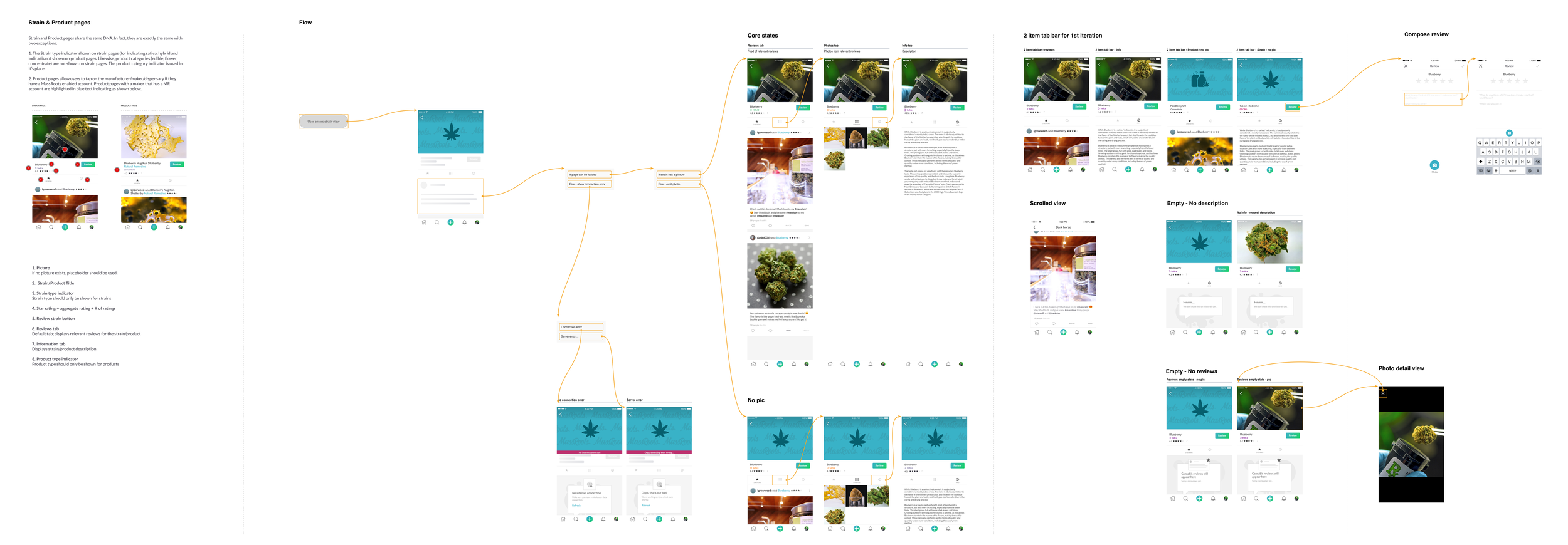
Explore and strain pages
The Explore experience needed to help us promote the dispensary finder, which was a new revenue stream for the company.
Due to the user generated product reviews, we created strain and product pages to help provide context about a strain or product.
We positioned cards at the top of the Explore view below search for discoverability of these new elements, but they could also be accessed from a post containing a product or strain review.
Cannabis review + post
We had to figure out what type of rating system to use for cannabis product reviews.
5 star scale? Larger more refined options like a 10pt scale?
Should they be weed leaves or something cute?
After extensive research and competitive analysis of other types of product reviews, we stuck with the star system in order to have a close relationship with existing mental models for other popular product rating systems.
We avoided the weed leaf icons for the rating system due to the research insight indicating we need to pull away from typical stoner stereotypes and not reinforce them.
Ex. Vivino doesn’t have bottles of wine as their rating icons, they use the star format like Yelp, Google, etc.
Dispensary finder
One problem we had to solve with the dispensary finder was how to help people quickly identify if a dispensary offered medical, recreational, or both on a map.
We decided to color code the pins and then disclose that information on a card once a pin/location is selected.
Businesses that offered both had a hybrid pin with both colors for recreational and medical cannabis.
Profile and settings
What I did
Stakeholder and value alignment
-
Executives
Increase social engagements and build B2B product to generate revenue
-
Marketing
Traffic and SEO impact
-
Sales
Identify new revenue channels
-
Customer support
Understand consumer pain points, points of friction, and areas of concern
Empathize
-
15 generative studies
Conducted 15 user interviews and activities to explore and understand consumer problems
-
30 validation studies
Conducted 30 user tests in total to validate the final solution
-
50 A/B tests
Launched 50 A/B tests to test and iterate on design details throughout the design cycle
-
3 site visits
Interviewed dispensary business owners to understand their customer acquisition strategy and consumer pain points it finding products
Insights
-
Avoid stereotypes
Move away from stoner stereotype branding
-
Product reviews
Tag and rate products that are hyperlocal to the
-
Standards for evaluating cannabis products
Standardize a way to describe cannabis products (feeling, taste, smell, etc)
Competitive analysis
-
Leafly
Cannabis information and strain rating app
No ability to rate products
Strain ratings highly variable based on producer
Limited social component
-
Weedmaps
Cannabis dispensary locater
Dispensary ratings
No products ratings
No social component
-
Vivino
Wine ratings and reviews
Individual wine ratings
Wine maker ratings
Social component
-
Rex
Recommendations the places to visit
Ratings for restaurants, parks, stores, etc.
No ratings for products at said places
Product Limited social component
Design
Led product design from the early stages to shipped product
Designed wireframes, flow diagrams, specifications, content, and prototypes
Conducted ongoing user research (moderated, unmoderated) using Lookback, Validately, and Ethnio
Influenced the product strategy and approach through qualitative and quantitative data collection
Implemented a geo-fence design to constrain usage to recreational and/or medical cannabis states within the US
Expanded the platform's focus to enable users to find products at nearby dispensaries, write reviews, and tag attributes for products and businesses to drive engagement across the app and local markets
Authored communications content for our releases and app store listings

Onboarding

Home feed

Explore

Search for strain

Compose / post

Photo picker

Strain review

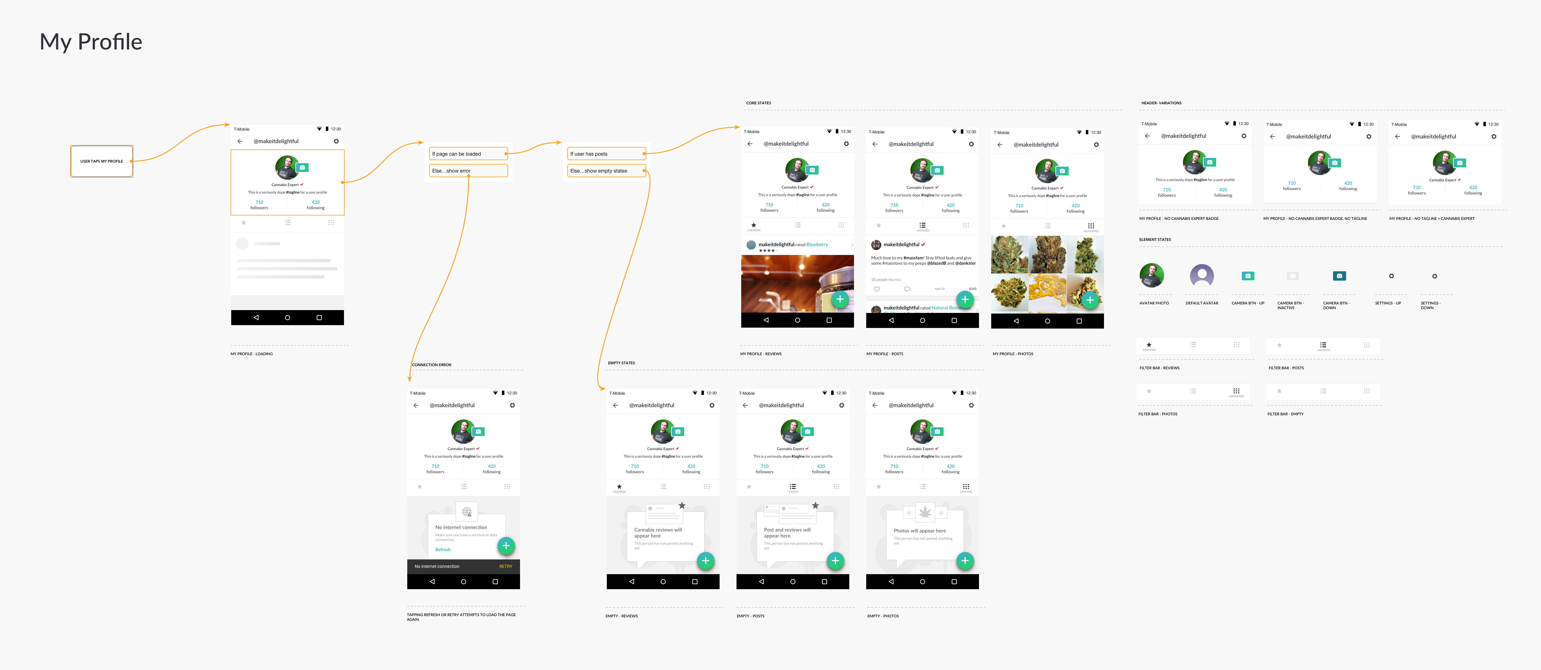
My profile


Leadership
Recruited and hired top design talent
Directed, managed, and mentored a product design team of three designers from junior to senior level
Established clear processes to improve efficiency and collaboration between the product, design, and engineering teams
Defined a career ladder for designers to ensure performance expectations are known at each level
Creative directed the in-house and consulting design teams in exploring a new brand strategy and visual identity
Result
-
App store rating improved
iOS App store rating improved from 3.3 to 3.9 stars; Google Play store rating improved from 2.9 to 3.6 stars
-
New revenue stream
The dispensary finder was a new B2B service enabling MassRoots users to locate dispensaries nearby, thus fueling local market sales
Dispensaries paid for premium placement
Phase 2 - integrate menus, order ahead / online ordering
-
Content and product discoverability
New search mechanism boosted content discoverability, and a dispensary finder increased local business and product discoverability
-
Product and strain reviews fueled user engagement
New product and strain review system enhanced user-generated content, which increased both user and business account engagement
-
Design and brand positioned for mass market adoption
The new company logo was more beautiful, inclusive and modern for reaching a larger audience
The mobile apps were aligned completely with native iOS and Android patterns
-
Design team growth
Increased the size of the product design team from 1 to 3 designers over 6 months